ROLE
Service Design Lead
TIMELINE
July 2023 – Now
TYPE
G2C Provincial Service
RESPONSIBILITIES
Wireframes/User Interface/Prototype/User Testing
TOOL
Figma
Introduced 5.6 million British Columbians to home energy retrofit opportunities and the rebates available to support their upgrades.
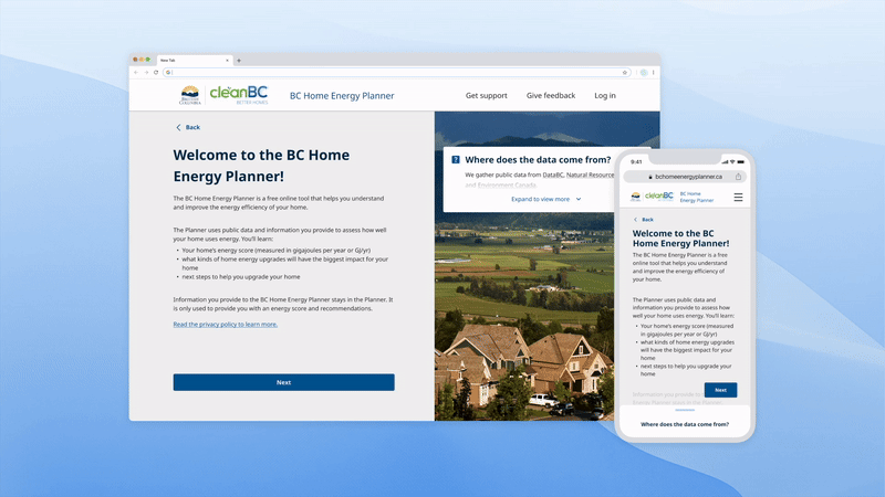
I had the opportunity to lead the design of CleanBC’s BC Home Energy Planner — a new service developed by the Province of British Columbia to help homeowners across B.C. explore energy-efficient home upgrades and access available rebates, supporting them in reducing carbon emissions and improving overall home performance.
🔗 👉Live site
Designing for a more sustainable future.
Performance of the provincial service in numbers.
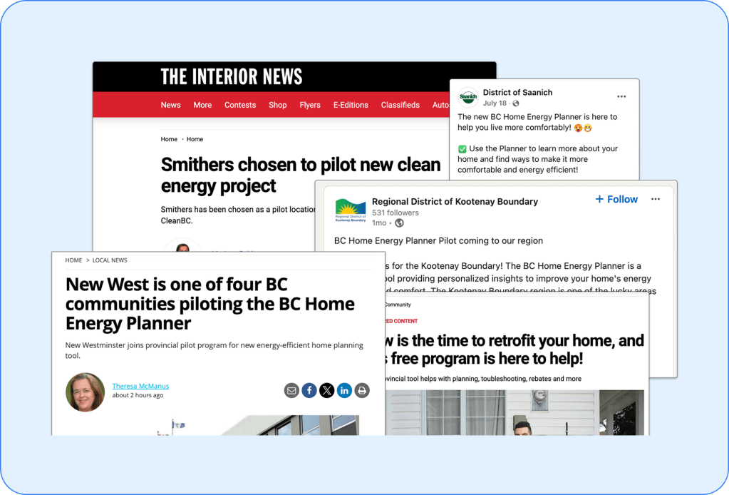
4 CITIES
Launched the pilot
Piloted in New Westminster, Smithers, Saanich Core & Kootenay Boundary.
500+
Unique pilot users
Onboarded during the 5 month pilot period between Aug – Dec 2024.
82%
Service completion rate
Of users that have successfully onboarded and began the first step of the service.
4.6/5
Average feedback rating
In a post-service survey asking pilot users to rate their overall experience.
LAYING THE FOUNDATION
- Understanding the Opinion on Energy Retrofits from a Homeowner POV
User surveys were conducted to inform the project kick-off. From the CleanBC Mailing List, participants were sent out a survey to assess their awareness surrounding retrofits and gauge the overall reception of this newly proposed service.
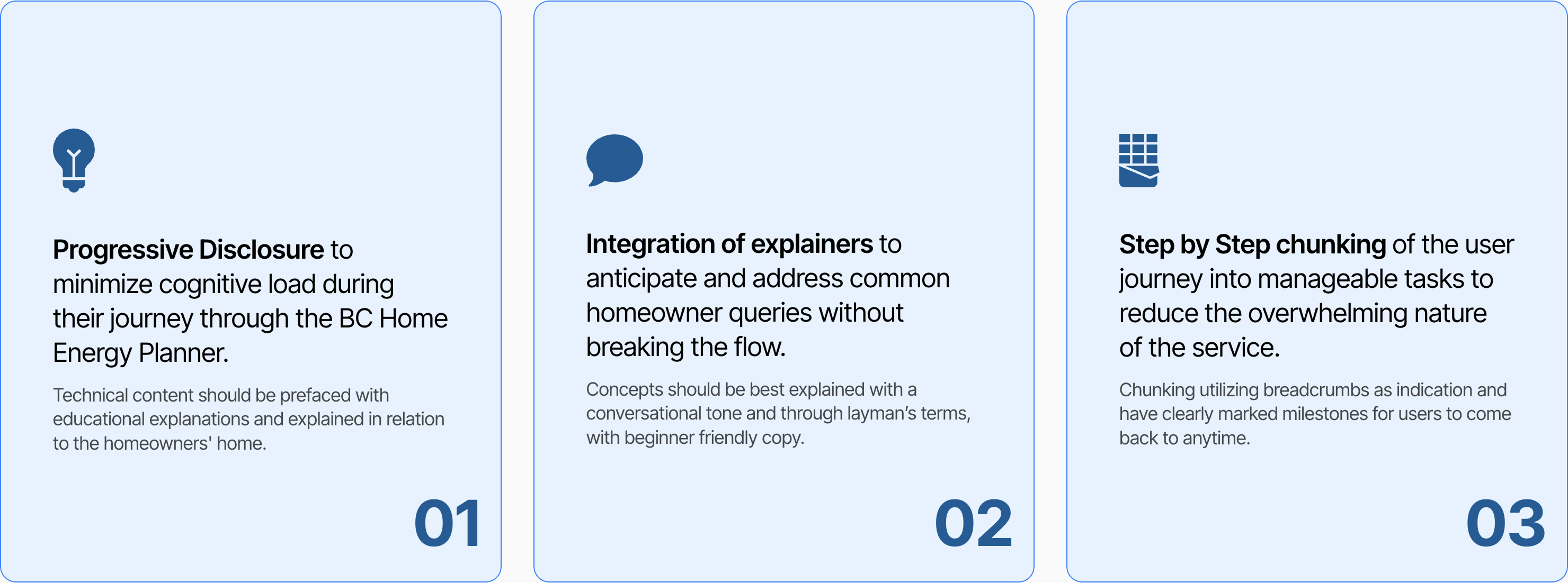
2. Translating UX Findings into Actionable Strategies
Given the insights from the user survey, I developed 3 core UX strategies that would inform my user flow and wireframe ideation, addressing the top 3 key reasons that is currently stopping BC homeowners to move forward with home retrofits.
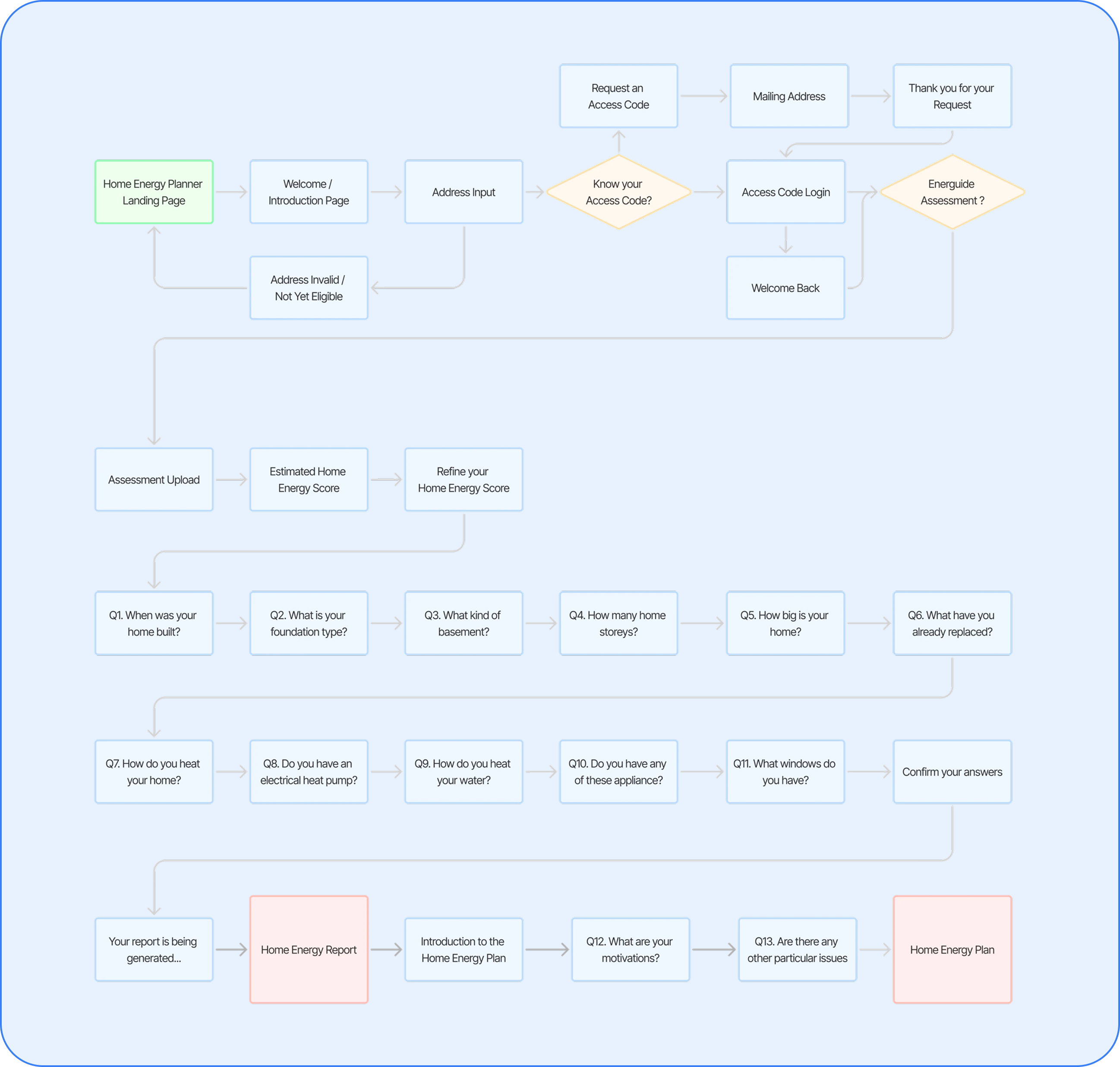
3. Alignment on the End-to-End User Experience
After multiple iterations and consultations with public sector stakeholders, as well as research into the underlying calculation model, alignment on the structure of the BC Home Energy Planner was reached and illustrated through an user flow.
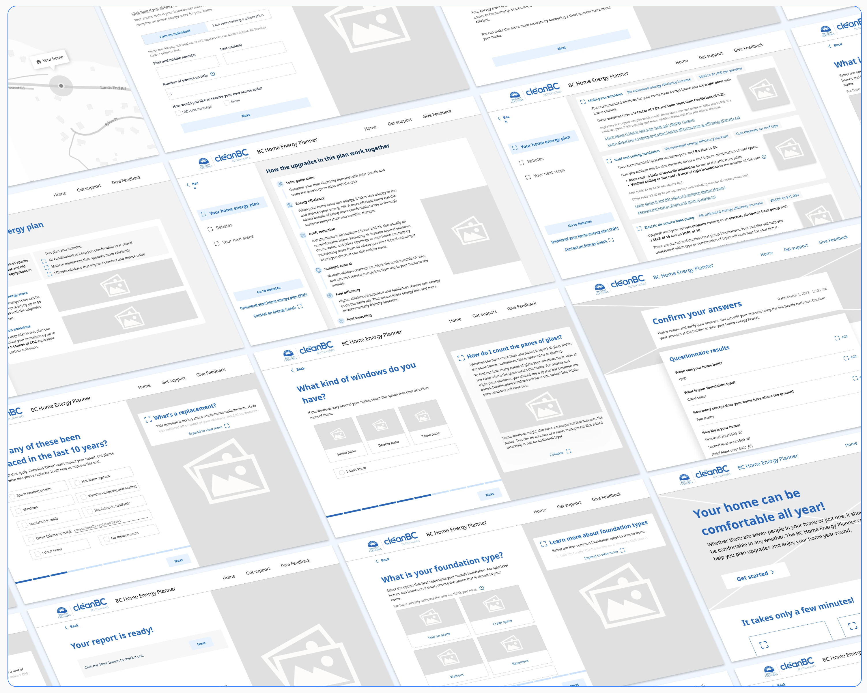
4. Rapid ideation into High-Fidelity Wireframes
Several rounds of co-design workshops within the dev team was conducted to brainstorm ideas collaboratively. Working closely with development teams and product managers, I ensured that the front-end UI provided sufficient affordances for the backend to compute an accurate energy model.
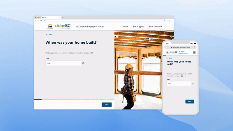
Drawing inspiration from existing provincial tools used across different ministries, I began my ideation process by sketching low-fidelity wireframes in Procreate. Once the concept received stakeholder approval, I transitioned to high-fidelity wireframes, designing within CleaBC’s design system and developing new UI components native to the planner in the process.
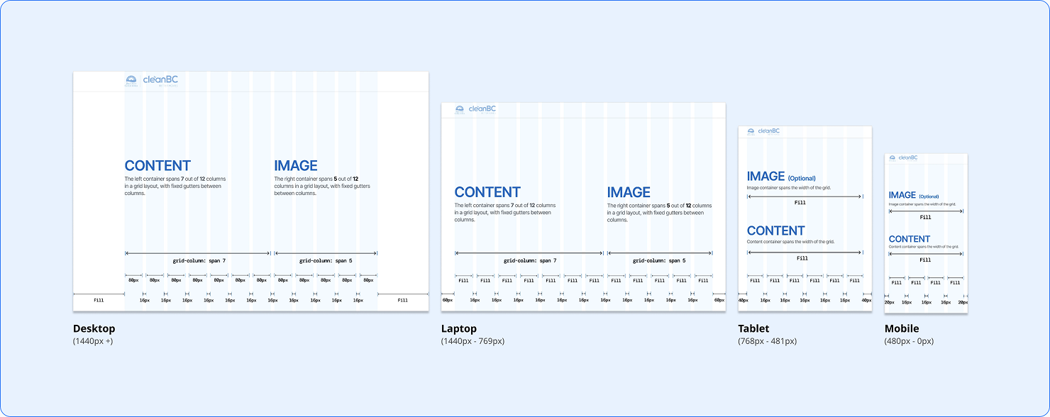
BASIC PAGE LAYOUT
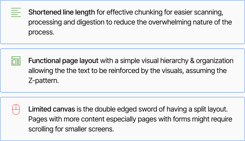
KeeKeeping it clean.
I used a classic split-screen layout to enhance readability and content flow. Instead of a balanced 50/50 split, I shifted the layout slightly in favor of the left content area to emphasize text over imagery, creating a clearer visual hierarchy.
VALIDATING OUR ASSUMPTIONS
1.User Testing Prior to Pilot Launch
Extensive remote user testing on homeowners was conducted on our high fidelity prototype prior to the pilot launch in 4 different cities within B.C.. I attended all user testing sessions taking on the role of support/observer during the testing sessions.
Prior to the testing, as the designer, I prepared an assortment of test materials in the form of interactive prototypes and comparison tests on different UI components and copy. Collaborating closely with the UX Researchers in the development team, we planned out our test-session scripts and established key metrics we wanted to achieve.
2. Observations, to Implications, to Iterations
Following homeowner testing, using notes and recordings from the testing sessions, I worked together with 2 other UX researchers to produce a findings report.
TURNING FEEDBACK INTO ACTION
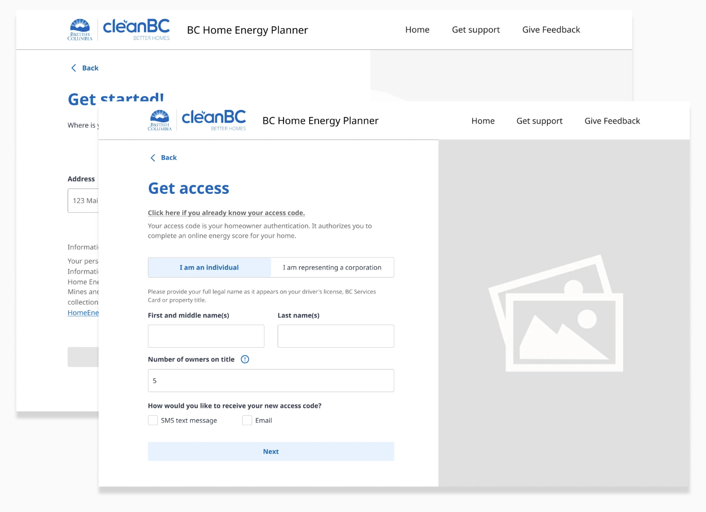
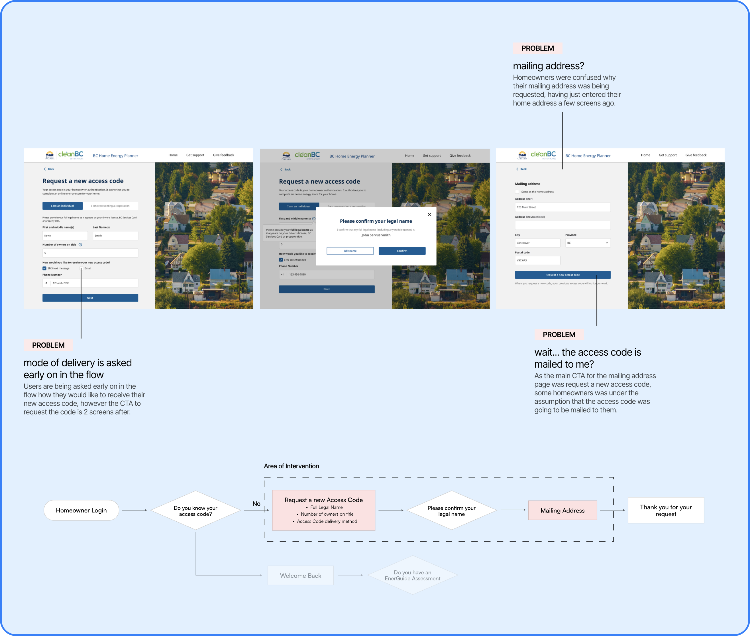
1 Homeowner Denied Access for Omitting Middle Names
People in the first pilot community were often failing to obtain an access code due to omitting middle names from the “first and middle name(s)” field.
It is critical for users to type in their full legal name in order for the backend system to verify the homeowner with the name on title for the submitted address. Without a match, the homeowners is denied from accessing the tool.
~8%
Login Failure Rate
Percentage of users who fail to login & abandons due to incorrect name entry.
37%
Correction Rate
Percentage of users who edit their name entry after an initial failure.
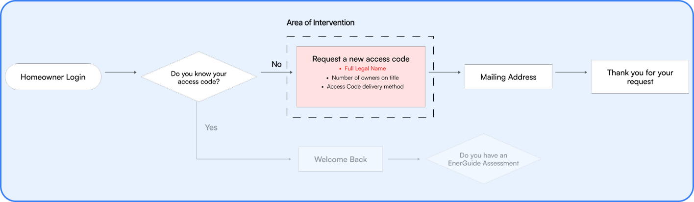
Solution:A Three-Pronged Approach
The three-pronged solution consisted of utilizing progressive disclosure to reorganize the order of the questions asked, adding a tooltip explaining why mailing address was needed, and streamlining the flow by making the entire step optional.
Referencing Nielsen Norman’s heuristics, I minimized the cognitive effort required from homeowners by utilizing progressive disclosure. I reorganized the order of the questions asked in order for the mode of delivery to be the last question asked, ultimately presenting decisions only when it was needed.
<1%
Backtracking Rate
Redesign did provide a negligable improvement in backtracking rate.
Percentage of users who fail to login & abandons due to incorrect name entry.
0:0:50
Average Time of Completion
Time of completion provided more promising results that echoed the testing results.
Initial data suggests an improvement but regardless a good A/B Testing candidate for future testing.
DESIGNING FOR GOOD
Leveraging Design for Positive Social & Environmental Change
Being given the opportunity to use design as a catalyst for positive change towards a more sustainable future, and to create a solution for a real-world problem that can truly make a difference for the masses feels beyond-rewarding.
Reading homeowner feedback during the pilot program was especially rewarding, as it was gratifying to see first-hand how my design made a real-world impact. It was even more fulfilling to watch my own family and friends engage with the service I created, taking the opportunity to learn about their home’s energy efficiency and retrofit upgrades available. Knowing that this tool made a difference in encouraging B.C. homeowners to take meaningful steps toward fighting climate change made every design decision feel worthwhile.
Championing my Design to a Diverse set of Stakeholders
Throughout the entire design process, the project regularly required me to effectively communicate the design and its value proposition to the public in a concise manner to different branches and ministries of the BC government.
This was particularly relevant when designing for the addition of the BC Services Card Integration and Climate Hazards from the Ministry of Emergency Management and Climate Readiness (EMCR). Collaborating with cross-functional public and private development teams often required me to become the “middle-man” in communicating design concepts and solution across sectors, ultimately driving the project to a successful, user-focused conclusion.
Understanding the Bigger Picture
I learned to achieve a balance between aesthetics, usability, compliance, learning to work within constraints while still delivering functional and engaging user experiences.
Public sector digital products are subject to strict regulations and standards. This project has taught me to take a holistic view of the program and account for external factors that may not have been a priority in previous projects. Government projects are often part of larger systems. Understanding how the project fits into and impacts broader systems and policy goals introduced many constraints that I had to design within, but helps in designing solutions that are scalable and sustainable.
In The News
“The pilot program has been tremendously successful, validating its value to homeowners, and granting us important opportunities for us to improve the tool prior to its provincial launch.”
– Brett Auger
BC Home Energy Planner Project Owner
